09-02-2009
|
#1
|
|
Pewp Champion
Join Date: Nov 2003
Location: Blaine
Drives: Teh Bean
Posts: 12,309
|
Registration #'s on my boat - opinions
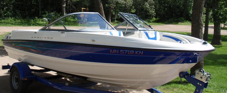
Well we finally got the Registration and Title for our new boat. So I need to get some numbers made to display on the boat to be legal. I'm trying to spend a little time in Adobe to get something that's going to look decent. No way am I just going to slap on some ugly square mailbox numbers on it.
The Minnesota 2009 Boating Guide Book states that:
- the numbers/letters must be 3" high, block style characters
- must be on the front half of the boat
- must contrast the backround
Now some of that I feel is a bit up for interpretation. "Block Style" is a bit generic. But the fonts I've chosen I feel would be considered that, since they are much more Block Like than the ones I've seen at Gander Mountain. But seems to be a pretty vaque rule.
Also, the contrasting backround. Well how contrasting? You'll see in some of mine I have a light blue on a dark blue that I feel contrasts somewhat, but others may not. Can't say I like the wording of their rules, but oh well.
If anyone else who's good with Adobe wants to give it a try and see if they can make something clean looking, feel free! The numbers you'll see on my example are the exact numbers my boat will need, so please use those numbers if you try some of your own. Also if there's any boat experts (peter) around that might be able to tell me if some of these would for sure land me tickets because they don't contrast enough...
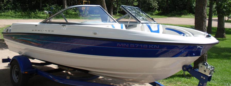
Here's the original picture:
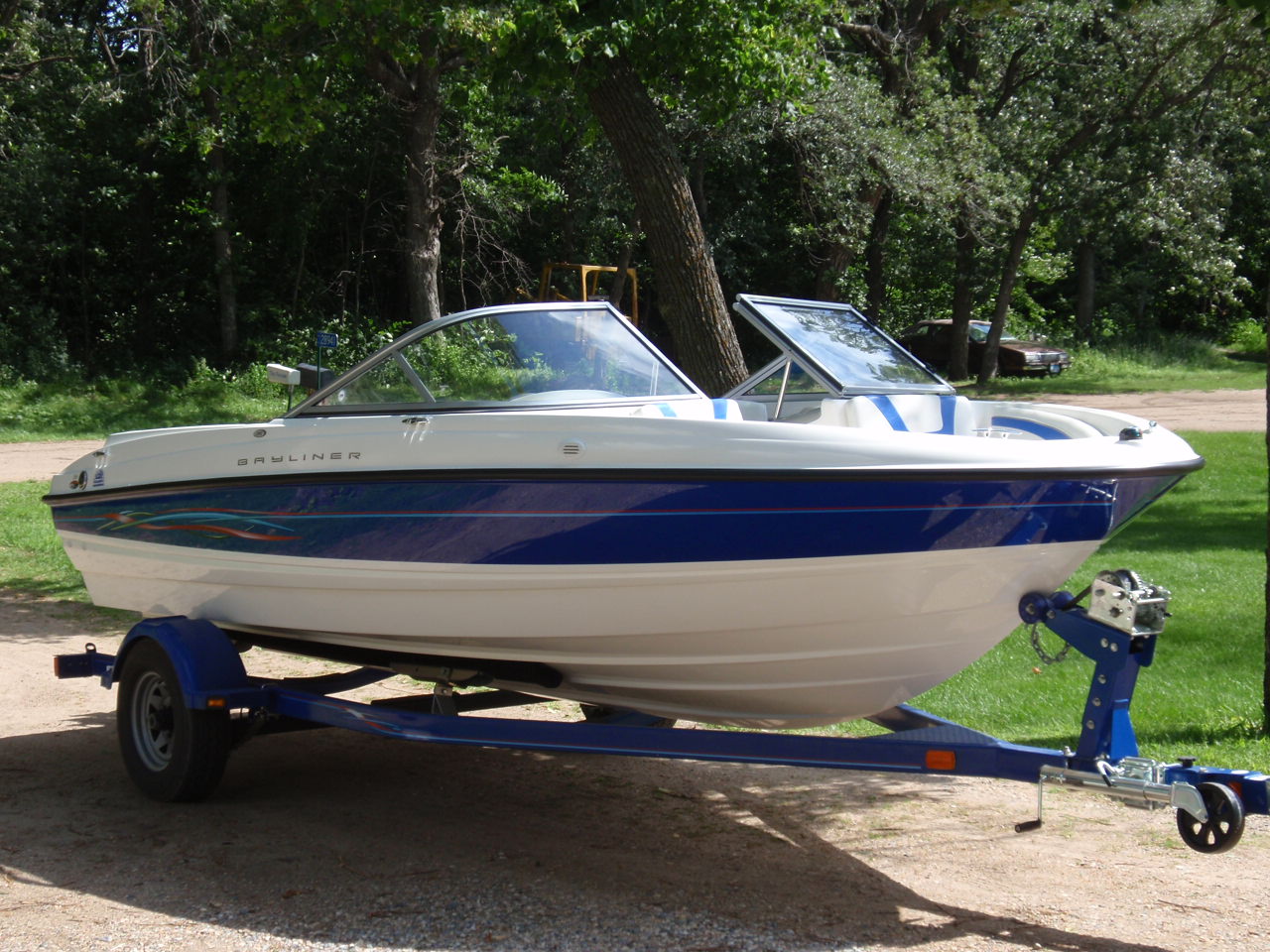
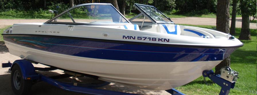
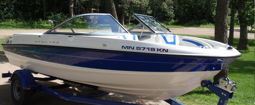
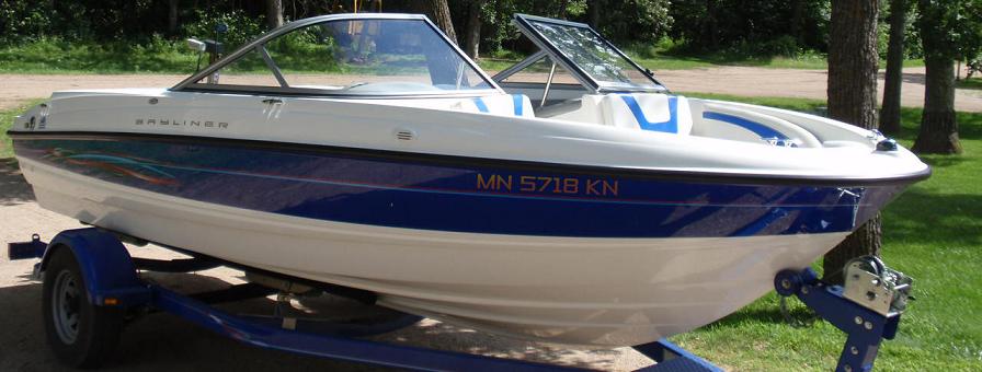
Here's some ideas I've had thus far. I've tried to keep it clean by using colors that are already on the boat (dark blue paint, light blue pin stripe, red pin stripe, white paint, yellow from the pin striping decals in the rear, etc).
You'll see I used some different fonts, colors, gradient fills, etc.
Last edited by Halon; 09-02-2009 at 10:51 PM..
|

|

|
|
09-02-2009
|
#2
|
|
Banned
Join Date: Aug 2009
Location: Suburbs
Drives: FS-T
Posts: 346
|
Re: Registration #'s on my boat - opinions
LOL! I have refreshed this page 2 times and every time your signature has slightly changed in less than a minute.
Anyways, only the first picture is showing for me... have you put the others up yet?
|
|
|
|
|
09-02-2009
|
#3
|
|
Pewp Champion
Join Date: Nov 2003
Location: Blaine
Drives: Teh Bean
Posts: 12,309
|
Re: Registration #'s on my boat - opinions
Yeah, I change things  haha
And yeah, there's 1 "original" pic and 7 "modified" pics. They are just linked from a boat forum I already put them on. Maybe you can't see them if you're not a member? THat's why I can and you can't? I'll try attaching them here instead. |
|
|
|
|
09-02-2009
|
#4
|
|
Big Turbo Monster
Join Date: Oct 2003
Location: Hopkins
Drives: GTS and E55
Posts: 1,105
|
Re: Registration #'s on my boat - opinions
Your pics on the bottom aren't working.
__________________
Life's tough.... it's even tougher if you're stupid.
7/25/09
Motorcycle cop pulls up next to me on UNI and says "Want to race?"
Me- "I don't think you would stand a chance."
Cop says "probably not" and drives off.
|
|
|
|
|
09-02-2009
|
#5
|
|
Banned
Join Date: Aug 2009
Location: Suburbs
Drives: FS-T
Posts: 346
|
Re: Registration #'s on my boat - opinions
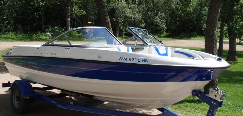
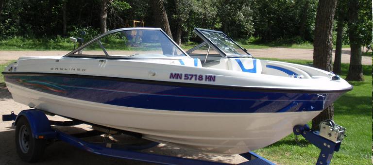
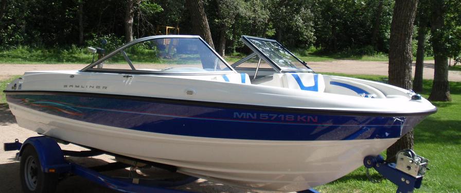
I like the 1st, 3rd, 7th, and 8th the best. (3rd is my favorite, looks real clean)
I'm sure you would be fine with them all, but if you ever booze cruise you probably would want to place the letters on the white part of the paint.
|
|
|
|
|
09-02-2009
|
#6
|
|
Pewp Champion
Join Date: Nov 2003
Location: Blaine
Drives: Teh Bean
Posts: 12,309
|
Re: Registration #'s on my boat - opinions
How about now?
|
|
|
|
|
09-02-2009
|
#7
|
Join Date: Jan 2009
Location: prior lake
Drives: to the shop
Posts: 411
|
Re: Registration #'s on my boat - opinions
3rd one
|
|
|
|
|
09-02-2009
|
#8
|
Join Date: Nov 2006
Location: Robbinsdale
Drives: Nissian
Posts: 1,295
|
Re: Registration #'s on my boat - opinions
4 or 5
__________________
F Subarus!!!
"I may drive a Subaru wagon but I don't munch grass I munch dirt"
-Emily

|
|
|
|
|
09-03-2009
|
#9
|
|
|
Re: Registration #'s on my boat - opinions
If interested and you have a vector file, send it my way and I'll get you the numbers for nothing. Or you could just send me the number, font, color and size... 
A single color is the easiest and quickest but I can print whatever color you want.
#3 and 4 are not going to be legal as they are similar in color to the back ground. Just a heads up.
__________________
Quote:
|
Originally Posted by shoutbox
cmspaz: Someone buys me a rubber fist, and I'll rock it on my hood.
|
|
|
|
|
|
09-03-2009
|
#10
|
|
Pewp Champion
Join Date: Nov 2003
Location: Blaine
Drives: Teh Bean
Posts: 12,309
|
Re: Registration #'s on my boat - opinions
I don't know what a vector file is, so I'm not sure. But I'm really trying to get this done tomorrow, so I'll more than likely just go to a sign shop and have them cut me some out of some vinyl sticker material. If I wasn't in a hurry, I'd take you up on your offer though Thanks! |
|
|
|
|
09-03-2009
|
#11
|
|
Shit Rocket Pilot
Join Date: Oct 2003
Location: Shoreview, MN
Drives: 2003 Evolution VIII
Posts: 7,752
|
Re: Registration #'s on my boat - opinions
#5 for sure
__________________
"If everything seems under control, you're just not going fast enough." -Mario Andretti
 03 Mitsubishi Lancer Evolution VIII
Quote:
Originally Posted by Tachyon

Every minute you spend in your Evo, not in boost, is a minute of your life you'll never get back.
|
|
|
|
|
|
09-03-2009
|
#12
|
|
flips McGee
|
Re: Registration #'s on my boat - opinions
I would keep it off that top white edge; remember this is a ski boat, and that's a great spot for diving off of, hanging onto, etc etc so IMHO put it a bit lower on the blue part where it won't be as succeptable to hands and feet peeling it off. I like the last few you did, esp the white fade to red lettering.
|
|
|
|
|
09-03-2009
|
#13
|
|
|
Re: Registration #'s on my boat - opinions
Last one for sure, matches the pin striping and decals and its very subtle! Blue letters on the white part look good too, and I doubt youll be hanging or jumping off that part of the edge much.
Sucks winters coming already! haha
|
|
|
|
|
09-03-2009
|
#14
|
|
Pewp Champion
Join Date: Nov 2003
Location: Blaine
Drives: Teh Bean
Posts: 12,309
|
Re: Registration #'s on my boat - opinions
Thanks for the feedback. Here's my thoughts on it all
I like the #5 as I feel it is very "contrasting" making it very "legal" I also like the lettering up on the white because the boat tarp hangs low enough that it's on the blue, so it will be completely covered with the tarp. With the letters on the Blue area, the tarp straps might hit it while the shake around during towing, and maybe cause some premature peeling... But, what I don't like is that it really sticks out a lot, liek "DAYUM LOOK THAT BOAT SURE IS REGISTERED!"
On the flip side, I think when the numbers are in the blue area, it looks more subtle and clean. All the "colors" and pinstriping and all that stuff is all going on in the blue area, so it seems like it'd look the cleanest if it was down there where everything else is happening. But I feel like it'd be the hardest to make match the rest of the boat, while still being contrasting enough to never get hastled by the shore patrol. And also worried about the rubbing of the tarp straps might make it peel prematurely.
So yeah, I'm still kinda torn. I do however think I'm going to avoid 3 and 4 because I'm hearing from a lot of others that may be asking for extra attention from the shore patrol because it's not contrasting enough. |
|
|
|
|
09-03-2009
|
#15
|
|
Transmission destroyer
Join Date: Feb 2007
Location: Cambridge
Drives: G37, 91 TSi
Posts: 7,150
|
Re: Registration #'s on my boat - opinions
I really like #4, maybe try it in white instead if you don't think it contrasts enough.
__________________

Quote:
Originally Posted by scheides
I swing from the nuts of cold hard data. Anything less is a guess.
|
|
|
|
|
|
09-03-2009
|
#16
|
|
aka Goodbye
|
Re: Registration #'s on my boat - opinions
Definitely keep it under the rubrail, but other than that, they all work pretty well.
|
|
|
|
|
09-03-2009
|
#17
|
|
back in the saddle again
|
Re: Registration #'s on my boat - opinions
I like the last one. Keeps it off the rail and contrasts nicely.
__________________
My street car runs low 11's and my race car's personal best is a mid 11....
|
|
|
|
| Thread Tools |
|
|
| Display Modes |
 Linear Mode Linear Mode
|
 Posting Rules
|
You may not post new threads
You may not post replies
You may not post attachments
You may not edit your posts
HTML code is Off
|
|
|
|
|


 Bloody Seal Bounce Champion!